


Exploratory Data Analysis (EDA) is a critical early step in any data science project. It involves investigating the key characteristics, relationships and patterns in a dataset to gain useful insights. A well-executed EDA can help uncover hidden trends, identify anomalies, assess data quality issues and generate hypotheses for further analysis.
In this article, we will look at the comprehensive steps for mastering Exploratory Data Analysis. Let's begin by understanding the key components of EDA.
What is Exploratory Data Analysis?
Exploratory Data Analysis (EDA) refers to the critical preliminary analysis of data to understand the underlying structure and behavior. Unlike confirmatory data analysis which aims to validate predefined hypotheses, EDA is an open-ended approach which allows data scientists to freely interact with the data without assumptions.
Main Goals of Exploratory Data Analysis
The main goals of EDA are:
-
Assess Data Quality
One of the primary goals of exploratory data analysis is to assess the quality of the available data. This involves identifying issues such as errors, missing or inconsistent values, and outliers present in the dataset. Such issues if not addressed can severely impact downstream analysis and model-building efforts. EDA techniques help uncover data quality problems that need to be dealt with before further analysis.
For example, through visualizing variables using histograms, we may notice unexpected values that need investigation. Computing summary statistics can highlight variables with numerous missing values.
-
Discover Individual Variable Attributes
Another key goal is to discover the main attributes and characteristics of each individual variable in the dataset. This includes understanding the distribution of numeric variables which may be normal, skewed or multimodal in shape. It also involves identifying the range or extent of values a variable can take as well as determining the most frequently occurring values for categorical variables.
For example, when exploring a variable containing patient heights in inches, we may find that heights range from 50 to 80 inches with a median of 68 inches indicating a right-skewed distribution.
-
Detect Relationships and Patterns
Exploratory data analysis aims to detect any relationships, associations, patterns or subgroups present within or between variables in the dataset. This involves investigating interactions between two or more variables through visualizations and statistical techniques.
For instance, creating scatter plots between variables can reveal correlations while grouping variables using dimensionality reduction may expose otherwise hidden clusters. Analysis of weather variables over time can display seasonal trends. Such findings provide invaluable insights into the underlying structure of the data.
-
Gain Insights for Modeling
Valuable insights drawn from EDA serve the purpose of selecting optimal variables for predictive modeling, generating new hypotheses about patterns in the data as well as aiding the choice of appropriate machine learning algorithms.For example, if analysis shows certain attributes are highly correlated, we may want to remove one to avoid redundancy. Recognition of nonlinear patterns suggests using nonlinear models. Subgroups exposed can motivate building separate models for each. In addition, new attributes created from EDA outputs such as cluster assignments can become features for modeling.
-
Data Wrangling
One important goal of EDA is to prepare raw data for analysis by performing necessary data wrangling tasks such as cleaning, transforming and engineering new features. This may involve handling missing data through imputation or deletion. It also entails transforming variables by scaling, binning or encoding categoricals.
For instance, date fields could be converted into meaningful time variables representing seasons, months or days of the week. New features may be derived by combining or applying functions on existing attributes. The wrangled, engineered data forms the basis for all subsequent exploratory and inferential analyses.
Achieving these objectives ensures a robust analysis of the available information and minimizes risks during predictive modeling.
Steps for Mastering Exploratory Data Analysis (EDA)
We can only make good decisions about data cleaning, choosing the right models, and picking important features after we really understand the dataset. Conducting a comprehensive EDA following the below 11 steps will help master this technique:
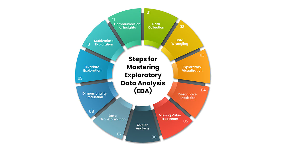
1. Data Collection
The first step is to collect all relevant raw data for the project from various appropriate sources like databases, CSV files, APIs, web scraping etc. It is important to clearly understand the context and domain of the problem being addressed, the features available in the dataset, their expected formats and any other metadata provided to select only the necessary data. For example, if analyzing customer shopping behaviors, the required data could be transactions, demographics, and past purchases collected from an e-commerce database.
2. Data Wrangling
Once the raw data is collected, it needs to be cleaned, organized and transformed into a format suitable for analysis. This involves tasks like removing duplicate records where the same data point is listed twice or more to avoid skewing results. Missing values are ubiquitous in real-world datasets and need handling either by removing cases with missing data or imputing substitute values.
Data types also need converting to appropriate formats - dates converted to date format etc. Any inconsistencies or errors in data need fixing through validation checks for example identifying and correcting incorrectly formatted phone numbers. Pandas in Python is a powerful library for performing these data wrangling tasks efficiently.
3. Exploratory Visualization
Initially visualizing individual variables and the relationships between them provides valuable insights. For numeric variables, histograms indicate distributions while boxplots show outliers.
Categorical variables can be understood through bar plots. relationship between variables can be explored through scatter plots. This preliminary visualization helps identify anomalies, uncover uneven distributions, pinpoint potential outliers and recognize patterns, correlations, clusters or associations between features which may not be obvious from summaries alone. Plots like histograms, boxplots, bar charts and scatter plots are immensely useful at this stage.
4. Descriptive Statistics
Calculating summary statistics of variables distilled in a central tendency and variability gives a quick intuitive understanding of the dataset. For numeric variables, measures like minimum, maximum, mean, median and standard deviation are extracted.
For categorical variables, counts and percentages for each category provide overviews. These together with visualizations provide an initial sense of patterns worth further probing and outliers requiring attention. Popular Python libraries like Numpy and Pandas facilitate extracting such descriptive statistics effortlessly.
5. Missing Value Treatment
Missing values are ubiquitous in real datasets and need careful handling. Looking at counts and percentages of missingness in each variable gives a sense of severity. The missing value pattern whether completely at random, at random or not at random also provides useful information for choice of treatment.
Common techniques include case-wise deletion of rows with misses, imputation with mean, median or mode and modern methods like MICE(Multivariate Imputation via Chained Equations). Python packages like Pandas or Scikit-learn assist with these tasks. Based on domain knowledge, the most appropriate missing data treatment is determined.
6. Outlier Analysis
Outliers contaminate results by skewing distributions and distorting relationships between variables in the case of regression modeling. They need identification and either removal or appropriate handling considering their impact. For numeric variables, outliers can be detected using measures like z-scores, 1.5 * IQR or 3 * standard deviation.
Boxplots provide a visual quick check too. Outlier treatment is again case-dependent, with removal being an option only if it is due to erroneous measurement but not if it represents an actual extreme observation. Python libraries Scikit-learn, statsmodels etc aid this step.
7. Data Transformation
Real-world data rarely conforms directly to assumptions of common machine learning or statistical techniques which expect variables to be normally distributed, without skewness and linearly related.
Transformations normalize the distributions and remove skewness and outlier impact through operations like log, inverse or power transformations applied based on the distribution shape assessed in previous steps. They also help extract meaningful features by scaling numeric variables to standard scales like Z-scores for better comparison. Transformations thus prepare data for analysis as well as modeling.
8. Dimensionality Reduction
For high-dimensional complex datasets, reducing features while retaining maximum information helps optimization and visual comprehension. Dimension reduction techniques like Principal Component Analysis (PCA) compress variables into a few uncorrelated components capturing the majority of variance.
Further feature selection filters out the least informative features. This simplifies models as well as enhances generalization. Supervised techniques like Linear Discriminant Analysis (LDA) aid classification problems by projecting onto dimensions of maximum separability between classes.
9. Bivariate Exploration
Pairwise relationships between all variables are visually explored through scatter plot matrices. These reveal striking linear, non-linear or no correlations, associations, formations of clusters or groups and other patterns between pairs worth further investigating.
Histograms of each variable conditioned on others show dependencies. Correlation heatmaps depict Pearson’s correlations collated. Python libraries like Seaborn facilitate customizable bivariate data visualization and analysis.
10. Multivariate Exploration
Building upon bivariate exploration, this step investigates the movement of multiple variables jointly with advancement over pairwise exploration. Heatmaps encoded with values of other variables reveal patterns with advantages over pairwise.
Parallel coordinate plots, Andrews curves and target projection plots enable understanding co-movement across many dimensions. Dimensionality reduction before this step assists interpretability.
11. Communication of Insights
Finally, EDA findings, patterns discovered, anomalies, most informative variables, relationships, limitations of the data, challenges faced and potential next steps are clearly and structurally documented in a report.
Key visualizations are inserted and statistically significant results from testing associations are reported. This structured communication circulated among relevant stakeholders ensures appropriate follow-up action, closes the loop by addressing queries and helps build upon learnings to gain further data-driven understanding to solve a given problem.
Overall, a well-executed comprehensive EDA following these established steps is key to fully leveraging the power of raw datasets and mastering this critical conceptual technique underlying various analytics streams. It forms a strong foundation for effective preprocessing, feature selection, modeling and most importantly drawing meaningful conclusions.
Tools and Libraries for EDA
Here are some tools and libraries for EDA:
Python Libraries
Some of the most popular Python libraries used for exploratory data analysis (EDA) include Pandas, NumPy, Matplotlib, and Seaborn.
-
Pandas
Pandas is an essential library for data manipulation and cleaning in Python. It provides data structures like Series and DataFrame that allow users to easily load, clean, and manipulate data. Pandas can be used to perform summary statistics and basic data wrangling tasks like filtering, sorting, and handling missing values. For example, we can use Pandas' .describe() method to get basic statistics of each column in our dataset with just one line of code. -
NumPy
NumPy is the fundamental package for scientific computing in Python. It adds support for large multi-dimensional arrays and matrices alongside a vast collection of high-level mathematical functions to operate on these arrays. NumPy is commonly used alongside Pandas for numeric computations during EDA. -
Matplotlib
Matplotlib is a comprehensive library for creating static, animated, and interactive visualizations. It allows for generating common plots like line plots, bar charts, histograms and scatter plots with just a few lines of code. Matplotlib forms the basis for more advanced and aesthetic visualization libraries in Python. -
Seaborn
Seaborn is a data visualization library built on top of Matplotlib. It provides a high-level interface for drawing beautiful and informative statistical graphics. Seaborn makes it easy to generate common plots found in statistical data analysis like joint and marginal distributions, correlation plots, nested violin plots, and heatmaps. It is commonly used for exploratory analysis to detect patterns and relationships in the data.
R Packages
Some key R packages used for exploratory data analysis include ggplot2, dplyr, tidyr, and plotly.
-
ggplot2
ggplot2 is one of the most popular data visualization packages for R. It provides a powerful and flexible grammar of graphics to create complex multi-layered plots. ggplot2 makes it easy to visualize univariate, bivariate and multivariate data using functions like qplot() and ggplot(). -
dplyr
dplyr is a very useful package for data manipulation and wrangling tasks in R. It contains fast versions of common data operations like filtering, sorting, transforming and joining operations to easily manipulate data frames. Some examples include grouping/summarizing data using group_by() + summarize() or selecting specific columns using select(). -
tidyr
tidyr is another essential tool for data tidying and reshaping. It contains functions to pivot tables for switching between wide and long data formats. This can help flatten messy datasets for downstream analysis. -
plotly
plotly can be used to create interactive plots, dashboards and web applications directly from R. It allows for building dynamic and publication-quality graphs for exploratory analysis, interactive reports and dashboards.
Choosing the right library based on analysis needs is important for effective EDA.
How EDA Can be Performed with Code
EDA can be performed using various programming languages, but Python is one of the most popular choices due to its powerful libraries like Pandas, Matplotlib, Seaborn, and Plotly. Here's how EDA can be performed with code:
Importing Necessary Libraries
First, you need to import the essential Python libraries for data manipulation and visualization:
import pandas as pd
import numpy as np
import matplotlib.pyplot as plt
import seaborn as sns
Loading the Dataset
Load the dataset into a Pandas DataFrame:
df = pd.read_csv('your_dataset.csv')
Basic Data Overview
Get a quick overview of the data using basic functions:
# Display the first few rows of the dataset
print(df.head())
# Get a summary of the dataset (data types, non-null counts, etc.)
print(df.info())
# Summary statistics of numerical columns
print(df.describe())
Handling Missing Values
Check for missing values and decide on a strategy to handle them (e.g., removing or imputing):
# Check for missing values
print(df.isnull().sum())
# Drop rows with missing values (example)
df = df.dropna()
# Or fill missing values with the mean (example)
df.fillna(df.mean(), inplace=True)
Univariate Analysis
Analyze individual variables:
# Histogram of a single variable
sns.histplot(df['column_name'], kde=True)
plt.show()
# Boxplot for detecting outliers
sns.boxplot(x=df['column_name'])
plt.show()
Bivariate Analysis
Examine relationships between two variables:
# Scatter plot for two continuous variables
sns.scatterplot(x=df['column_x'], y=df['column_y'])
plt.show()
# Correlation heatmap
plt.figure(figsize=(10,8))
sns.heatmap(df.corr(), annot=True, cmap='coolwarm')
plt.show()
# Boxplot to compare categorical and continuous variables
sns.boxplot(x=df['categorical_column'], y=df['numerical_column'])
plt.show()
Multivariate Analysis
Explore relationships involving more than two variables:
# Pair plot to visualize relationships between multiple variables
sns.pairplot(df)
plt.show()
# Grouped bar plot for categorical variables
sns.countplot(x='categorical_column_1', hue='categorical_column_2', data=df)
plt.show()
Identifying Patterns and Trends
Look for patterns or trends in the data:
# Line plot to see trends over time
df['date_column'] = pd.to_datetime(df['date_column'])
df.set_index('date_column')['value_column'].plot()
plt.show()
Dimensionality Reduction (Optional)
If the dataset is large, techniques like PCA can help reduce dimensions:
from sklearn.decomposition import PCA
pca = PCA(n_components=2)
principal_components = pca.fit_transform(df.drop(columns=['target_column']))
principal_df = pd.DataFrame(data=principal_components, columns=['PC1', 'PC2'])
sns.scatterplot(x='PC1', y='PC2', hue=df['target_column'], data=principal_df)
plt.show()
Conclusions and Next Steps
Based on the EDA, summarize your findings and consider the next steps:
# Example summary
print("The data shows a strong positive correlation between X and Y...")
print("Outliers were detected in column Z and might need further investigation.")
This is a basic guide to performing EDA with code. Depending on your dataset and objectives, you might explore additional techniques or visualizations.
Conсlusion
Exploratory Data Analysis requires iterating between visual, and statistical techniques and domain knowledge to fully comprehend the data. Mastering EDA through practice is key to extracting useful insights, formulating problems impactfully and overcoming challenges - critical foundations for a successful data science project. With these steps, you are well-equipped to explore your way to valuable discoveries!


