


In today's world, where information is available at the click of a button, numbers can only go a long way in proving points but cannot motivate people to take action. Data storytelling makes data more engaging by telling the stories that drive insights. It connects facts with a human angle, which helps to fill the void between information and wisdom to support decisions made by the leaders. Traditionally data presentation was just about using charts and graphs; but today, with a modern twist, data storytelling is a captivating and engaging presentation that incorporates data, visuals, and context within an organization to facilitate a call to action based on the data or information.
The Core of Effective Data Storytelling
Data storytelling goes beyond merely presenting numbers and graphs; it encompasses the art of telling a captivating story with data. In its essence, data storytelling combines the rationality of analysis with the passion of a story to pass on insights in a readily understandable manner.
Key Elements:
- Narrative Structure: Storytelling enables the audience to relate and make sense of the data. It gives them context and makes the numbers more meaningful by turning them into a story.
- Visual Representation: Data visualization is essential for interpreting the intricate details of significant data into more understandable forms and making a lasting impact.
- Contextual Relevance: Adding context helps orient the viewers to the presented information, thus making it engaging and relevant.
Data storytelling effectively sways critical decisions and encourages essential discussions when implemented together.
The Aspects of Data Storytelling: Connecting Data with Audience
Data storytelling involves more than providing figures; it concerns making those figures audible. Understanding the various dimensions of data storytelling is essential for this.
Siloes are what hold our industry back. As a film composer-turned-data-professional I realized our industry was siloed from art, music, and story. Time and time again, I saw brilliant dashboards, models, and reports go unused and under-appreciated because they were just a bunch of numbers on a screen - stakeholders tuning out because their attention wasn't engaged. I realized the humanities had important lessons to share and gave a TEDx talk in August 2024 about how music can make our data sing:
- Researchers like Daniel Kahneman have shown there are two modes of cognitive processing: a quick, intuitive mode based on emotion; and a slow, analytical mode based on logic.
- If we just use facts and numbers to persuade, we are not respecting the emotional intuition that governs a large part of our thinking.
- In order to communicate data effectively, we need to put it in context, like adding harmony to notes in music. We need to say not only what the values are, but what they mean to our audience (the "so what") and what our audience should do about them (the "now what"). That's how we respect both the intuitive and analytical modes of thought, and how we break out of the silo that holds back standard data communication.
— Christopher Chin | Founder & CEO | The Hidden Speaker
Link to the talk: https://youtu.be/Z9kyZWucNc8
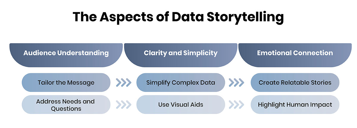
1. Audience Understanding:
- Tailor the Message: Understand your audience's experience, knowledge, and passions. This will enable you to come up with an appropriate and exciting story. For instance, while presenting to a technical audience, one might use tables and analyses to present statistical data instead of showing the final highlights to a general audience.
- Address Needs and Questions: Concentrate on the issues or questions your target audience needs to answer. This helps ensure that the data storytelling is not only engaging but also valuable.
2. Clarity and Simplicity:
- Simplify Complex Data: Never put too much effort into explaining your images so that you will not bore the audience. When presenting large sets of data, write simple and easily understandable text using smaller headings and subheadings. This is helpful in the sense that it increases engagement and comprehension.
- Use Visual Aids: Allow data visualization to make it less complicated and significantly more understandable. Charts and Graphs make complex data easier to comprehend and do not necessarily scare people away.
3. Emotional Connection:
- Create Relatable Stories: Incorporate aspects that create a sense of feeling or an example of consequence. For instance, the data can be supplemented with real-life stories presented in case studies or analogies to real-life situations.
- Highlight Human Impact: Demonstrate how the data affects people's lives or businesses. This connection can seal the deal by emphasizing the data, making the story impactful.
By considering these aspects, you can come closer to the audience and link the data to the outcome, making your data storytelling not only efficient but also powerful.
Designing Effective Data Visualizations
Data reporting is essential for data narration since it converts numerical tables into easily understandable graphical interfaces. Compelling data visualizations can positively impact the information flow and make data more easily consumable and engaging to the intended audience.
Choosing the Right Visuals:
Choosing the correct type of visualization depends on the characteristics of the data and on what you want to show. For instance:
- Bar Charts are best used when one needs to compare quantities with categories.
- Line Graphs are mostly preferred when showing changes occurring over time.
- Pie charts are suitable for displaying the relative sizes as a whole.
- Heatmaps are used to show the distribution and densities of data.
Best Practices in Data Visualization:
The following principles should be followed when developing visuals to ensure people respond positively to them:
- Clarity: Make sure that the figure is easy to comprehend and reject. Rejecting ttthe inclusion of unnecessary details., Tthe designs should be clear and uncluttered.
- Consistency: To enhance the organization across the entire visual set, try to remain consistent with the color selections, font type, and styles.
- Accessibility: Design for accessibility by being cautious about color selection, minimizing the issue of color blindness, and ensuring enough contrast.
Tools and Technologies:
Many resources are available to help with creating engaging information graphics.
- Tableau: Provides various data interpretation tools that can be engaged and easily shared.
- Power BI: It offers sound data integration and robust capabilities for creating graphical data representations.
- D3. js: A framework in JavaScript for building adaptable and unique graphics.
- Google Data Studio: Enables development of user-defined dashboards with drill-down options and complex reports.
Following these best practices and using the right tools, it is possible to create meaningful and vivid data that complements basic data storytelling. This not only transforms the vast and sometimes confusing information into easily understandable forms but also helps the target audience better perceive and memorize important outcomes.
Crafting the Narrative: From Data to Story
Telling a story from the data is an integral part of data storytelling. The process starts with creating a coherent narrative that the audience will follow to understand the data. The information must be presented chronologically and logically with a clear introduction, body, and conclusion to make it easier to understand and memorize.
- Building the Narrative Arc: Begin with an introduction that will present the readers with an overview of the data story. Introduce the data in terms of context and importance to prepare the audience. In the middle section, provide the most important information about the study, ensuring that each point follows the previous one. End with a conclusion of the findings made and a restatement of the implications of the data.Lastly, end with a conclusion of the findings made and a restatement of the data's implications.
- Highlighting Key Insights: Emphasize the critical results of the analysis based on the data. To make these insights memorable, relay them in the form ofas stories that the listeners would easily understand. Provide the audience with a manageable amount of information where they get lost and confused; instead, summarisesummarize the information in simple, concise messages that can be acted upon and support the story.
- Using Data to Drive the Story: The data should also refrain from dominating the presentation and stealing the focus from the story being told. Make sure that every data that is incorporated is relevant and serves the purpose of enhancing the general information that is being presented. Please refrain from including all the available data; choose the data supporting the story's objectives and keep it simple.
Telling a story from data is a delicate process. The story has to be informative and insightful while also coherent and interesting. By following these steps, it is possible to narrate a story from data in a way that will engage the audience.
Integrating Components: A Holistic Approach to Data Storytelling
Effective integration of components are critical in developing a coherent and engaging data storytelling experience. This involves ensuring the story syncs with the data visualization to convey the right message.
Aligning Narrative and Visuals
- Narrative Consistency: Make sure that the script for the video is harmonious with the visual part. The story should flow from one visualization to another, and each visualization should, in some way, augment the existing text. For instance, if your story has to do with a particular trend, then your visual elements must depict this trend.
- Visual Harmony: Select images appropriate for your story and the mood you are trying to establish. Using the same color palette, font, and chart styles to tell the story ensuring the reader does not get lost.
Balancing Data and Story
- Avoiding Overload: A common mistake is presenting the audience with too much information or complicated graphics. Always provide only the data that supports your key messages, and try not to overload your audience with unnecessary details.
- Clarity over Complexity: Keep the story and images simple. Make sure your story is easy to understand, and use simple graphics and charts so that anyone can understand it, even if they are not data literate.
Addressing these dimensions is crucial for compelling data storytelling, as they ensure that the narrative and visuals are in harmony and make sense to the audience. When done correctly, these components can will help create data stories that capture people's interests and actions.
Evaluating the Effectiveness of Data Storytelling
Evaluating the impact of data storytelling is essential to guarantee that what you do has the intended effect on your audience. To determine how well your data story has performed, consider the following aspects:
- Engagement Metrics: Find out the level of engagement with your audience regarding the data story you have shared. Some key metrics that can be used to show high engagement include time on story, click-through rates, and social shares. Such metrics represent the extent of the story's power to attract and engage readers.
- Audience Feedback: Gather qualitative information through a survey, an interview, or personal comments. The clarity, relevance, and impact of the data story as perceived by the audience may help determine its utility.
- Achievement of Objectives: Evaluate whether the data story achieved its purpose. This may involve creating awareness, calling for a decision, or calling specific actions. Assess whether the story provided meaningful information and contributed to achieving the goals.
- Data Retention and Understanding: Determine the audience's level of comprehension of the information being presented to them. Further tests or quizzes can be carried out to determine whether the main ideas and conclusions have been properly passed on and understood.
Therefore, tThese evaluation criteria are essential as they will help you improve your data storytelling skills to ensure that every story you tell has the desired impact.
Conсlusion
Rapid advancement in data storytelling has become crucial in the contemporary business world as it helps to share insights and prompt action. The elements that need to be included
- a good story,
- effective use of data visualization, and
- knowledge of the target audience.
Adopt these principles and tools to enhance your data presentations, making them informative and effective. Begin using these methods to change the way that your audience engages with and perceives data.


