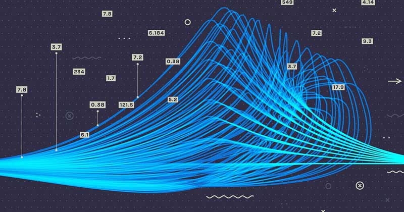
“A picture is worth thousands of lines of data,” a slight modification to the original Frederick R. Barnard’s adage- “A picture tells a thousand words.” Visualization is most appealing to the human brain, and this is what makes data visualization a fundamental skill for a data science professional.
Data visualization is a technique where abstract statistical and numerical information is translated into attributes of vision – color, shape, size, position, or motion - to communicate, analyze, and arrive at important business decisions. Data visualization helps organizations translate the humongous data into a form that our brains can interpret easily, get a quick sense of the story, make decisions, and plan for the future.
Verified Market Research™ reports that the data visualization tools market will be worth USD 11.79 bn globally by 2028, growing at 10.4 percent CAGR.
Data visualization: The what and why for an organization
Human brain can process images 60,000 times faster than texts!
Data visualization is a skill that all organizations have started to appreciate. They look up to data scientists to explain the processes and results more easily with visualization. It is useful for data cleaning, structure data, detecting outliers, identifying trends, spot patterns, understanding clusters, evaluating output, and presenting results.
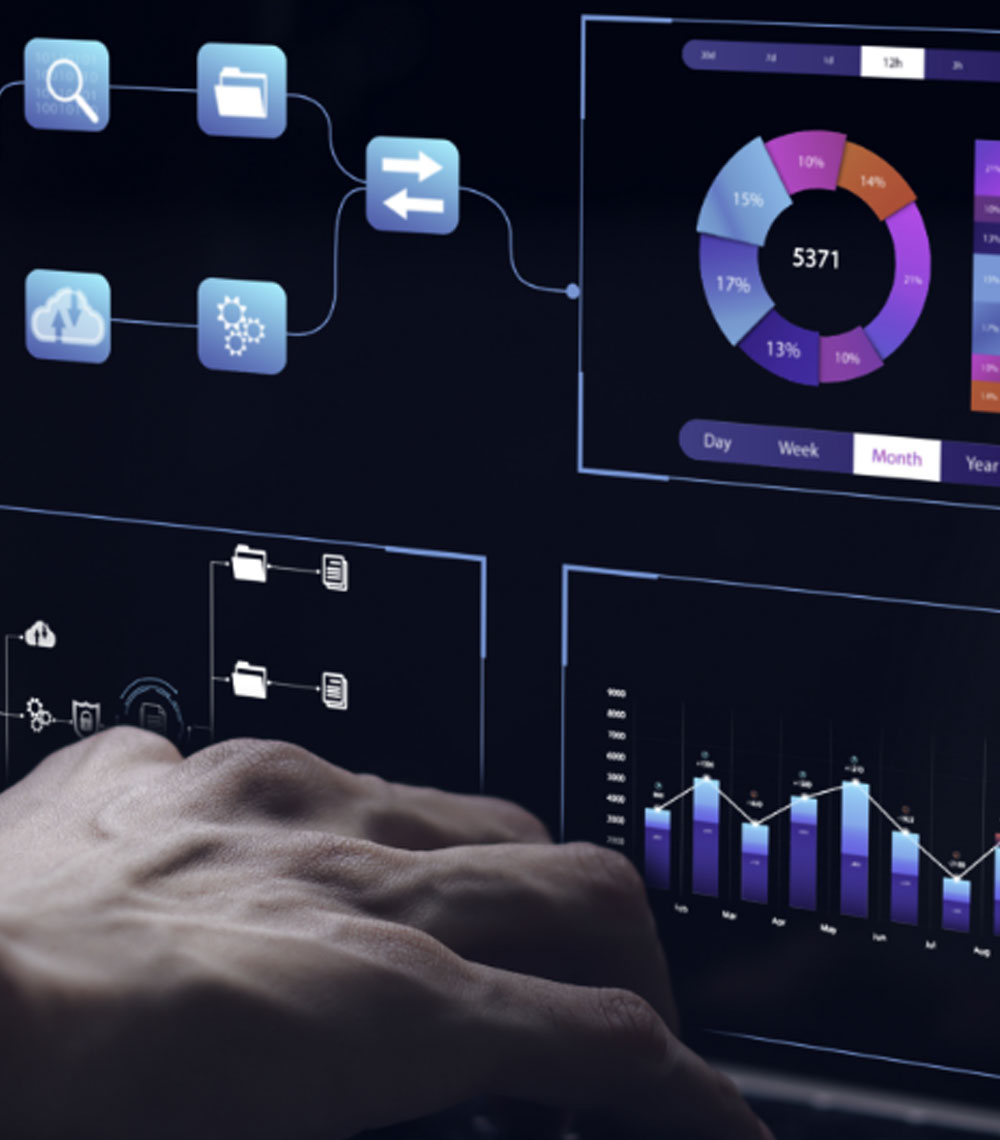
Take a look at the big data visualization sample images here.
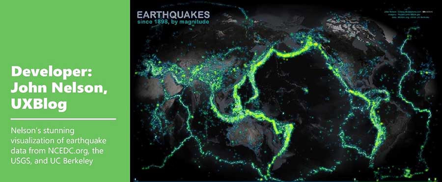

In an organization, a data science professional, or a data scientist, in particular, have to simplify a project to make it understandable for the stakeholders, business leaders, and clients. To get a ‘buy-in’ for a project, data visualization will be beneficial. It could involve a simple usage of PowerPoint presentations, Jira, or Lucid charts. We have covered some of the different types of data visualization used by professionals here.
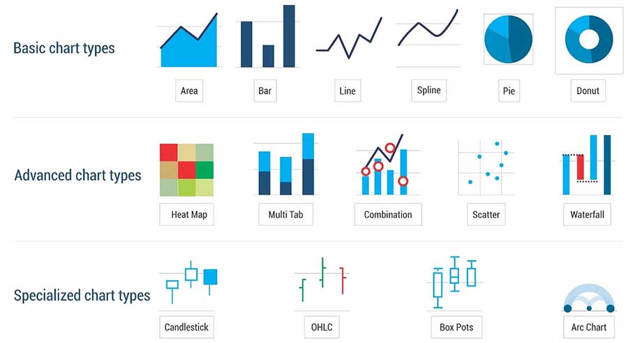
Source : https://dbinform.com/wp-content/uploads/2019/11/diveport.pdf
So, data visualization is becoming a critical skill for today’s professionals.
Data visualization: A critical skill for data science professional
The goal is to turn data into information, and information into insight ―Carly Fiorina
Data visualization skill is a must to have to present the insights derived from data to fellow workers, non-technical team, stakeholders, and business holders. With this skill, one can –
- Make data more accessible and less confusing
- Tackle business problems and find solutions in a timely manner
- Use pie charts, scatter plots, line plots, heat maps, bar charts, etc.
- Manage humongous business data in a clear and cohesive manner
- Make data work for the organization
With data visualization, data science professionals can emphasize on data, make large datasets coherent, compare different pieces of data, reveal data at multiple levels of detail, and think about the substance of the information. In brief, complicated processes and business results can be explained easily with it.
Moving forward, let’s understand the tools data scientists and big data analysts use. Here are a few of the popularly used data visualization tools.
5 commonly-used data visualization tools for business
Data visualization tools help businesses visualize the data generated by business processes and create dashboards to track the data.
You may be also interested in Best BI tools widely applicable for data visualization.
Tableau
It is an open-source platform where data can be incorporated from a spreadsheet or entered manually. Tableau helps to create simple charts for interactive visualization to analyze big data and events.
Sisense
It is the AI-powered analytics platform where a set of APIs is used to generate data visualizations and actionable analytics. It is highly customizable and available both in the cloud and on-premise. This tool is used to visualize large amounts of data and help businesses gain insights.
Visme
It is mainly used to create visual brand experiences such as emails, reports, e-books, animations, and flyers. It can pull data from several resources to generate illustrations, presentations, and infographics.
Google Data Studio
It is a cloud-based platform that imports data from multiple sources such as Google Analytics or Google Ads. It incorporates automated reporting and interactive dashboards.
iDashboards
It is an application that can combine data from more than 160 sources and offers hundreds of chart and design options. It also uses real-time data feeds and helpful for real-time operational intelligence.
Data visualization: Uses
Data visualization can be used for all businesses irrespective of their sizes - small, medium, or large. It is used across industry verticals such as logistics, telecommunications, manufacturing, retail, government, BFSI, healthcare, life sciences, media and entertainment, travel and hospitality, education, energy, and utilities.
Not to mention, visualization can be used across all the business functions such as human resources, marketing, finance, and operations. Data visualization: Case studies
Case study 1: Making data actionable at Uber
1. UBER USES DATA VISUALIZATION TOOLS
Uber handles billions of GPS points every day posing a typical challenges for real-time mapping visualization. You can see the data visualization crafted by Uber’s big data engineering team to show traffic per street with and without UberPool. It clearly demonstrates their ability to make cities smarter by reducing traffic.
Source: https://eng.uber.com/data-visualization-intelligence/
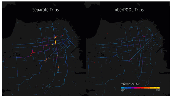
Left: SF without UberPool experiences traffic congestion downtown.
Right: POOL moves the same number of people in smarter way.
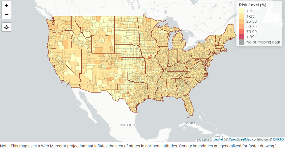
Case study 2: COVID-19 Event Risk Assessment Planning
2. PANDEMIC STATISTICS USING DATA VISUALIZATION
This map shows the risk level of attending an event considering the event size and location. The risk level is nothing but the estimated chance that there will be at least one COVID -19 positive individual at an event.
One can reduce the risk by wearing a mask, maintaining social distancing, and gathering outdoors in smaller groups.
Source: https://covid19risk.biosci.gatech.edu/
Conclusion:
As industries accelerate their digitalization process, they are tapping the power of data analytics at every step as they can. In this effort, if industries can pair it with data visualization, it can help them to become more focused on business decisions.
However, there may occur advanced analytics issues, predictive model errors, or misuse of statistics when there is a lack of expertise. As a result, industries seek data science professionals who can explore their business data with full confidence and avoid errors.
If data visualization is your forte, then you are the data science professional the industry seeks. Claim high-level jobs by becoming a globally-recognized data professional with DASCA’s data science certifications today.


